Turn off Content Link encoding for specific fields
You can now disable Content Link (visual editing) encoding on a per-field basis, right from the field settings. Fields whose exact value matters — slugs, external IDs, keys, anything compared verbatim — can opt out, so the Content Delivery API never wraps their value in invisible visual-editing metadata.
A quick refresher on how Content Link works
Visual editing lets editors click directly on any element of your live site and jump straight to the field that controls it. It works through steganography: when you request draft content with Content Link enabled, the Content Delivery API embeds invisible Unicode characters into your text fields, encoding which record and field produced each string. Your <ContentLink /> component reads that metadata and paints the clickable overlays. Visually, nothing changes, but that invisible metadata is exactly what you don't want on certain fields.
The problem
Because the encoded value carries extra (invisible) characters, it's no longer byte-for-byte identical to what you typed. That's harmless for prose, but it breaks anything that treats a field as a literal:
A
slugfield with the valueaboutno longer==="about", so routing and equality checks fail.IDs, keys, and tokens used in comparisons,
switchstatements, CSS selectors, ordata-attributes silently misbehave.
Until now, the fix meant calling stripStega() on the values that needed it. That still works, but it's easy to forget and easy to miss one.
What's new
Open any string, multiple-paragraph text, or structured text field's settings, and you'll find a new toggle:
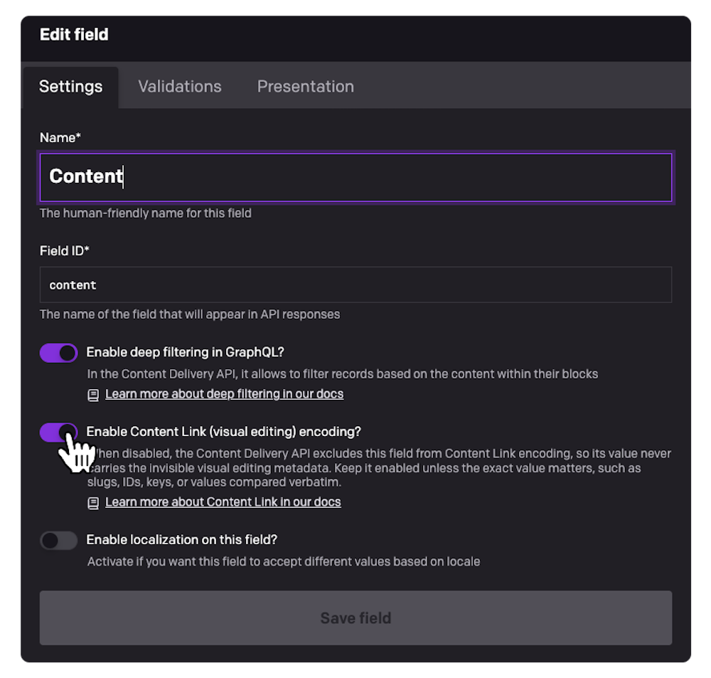
Leave it on for the fields your editors want to click into. Turn it off for the fields that need to stay verbatim, and the CDA will exclude that field from Content Link encoding entirely and the value ships clean, no stripStega() required.
The toggle is enabled by default, so nothing changes for your existing projects unless you opt a field out.
Under the hood
A new
content_link_enabledattribute is exposed on the field, defaulting totrue.The opt-out is available on the field types that participate in Content Link encoding today:
string,text, andstructured_text.When disabled, the exclusion happens server-side in the Content Delivery API, so it applies no matter which client or framework SDK you use.