Welcome to a new chapter of the evolution of the DatoCMS interface! Hot on the heels of our recent navigation system revamp, we've got more good news to share, as we’ve turned our attention to the Schema interface. This update is not just a facelift; we believe it's a strategic enhancement designed to simplify your content modeling process.
Let's dive into what's changed, and why we think it'll make your life easier.
A place for everything, and everything in its place
First up, let's talk about keeping things tidy and organized. We've recognized that as your projects grow in complexity, the need for a more flexible and organized content modeling space becomes paramount.
With our new drag-and-drop functionality, you can now organize your models and blocks into groups and subgroups, reflecting the hierarchical structure of your content more accurately, and bringing much-needed clarity to your workspace.
It's like sorting your documents into neatly labeled folders; everything is where you expect it to be, making navigation and updates a breeze.
History at your fingertips
Ever find yourself editing a model, hopping over to another task, and then needing to go back to that exact spot? We know first-hand that content modeling is often iterative, requiring frequent tweaks and adjustments. To support this, we've introduced a history icon at the top right of the Schema navigation.
This nifty addition provides immediate access to your five most recently opened models/blocks, saving you time and keeping your momentum going when bursting through your work in DatoCMS.
Find anything in a snap
The search bar has found a new home at the top left of the Schema navigation, offering improved efficiency. Now, searching returns both models and blocks in the results. Whether you're looking for a specific model or that elusive block, type it in, and voilà! You'll see a neat list, complete with icons, plus breadcrumbs if they're part of a group.
This upgrade ensures that no matter how expansive your schema becomes, you can quickly locate exactly what you need.
Personalize with Emojis 🎉
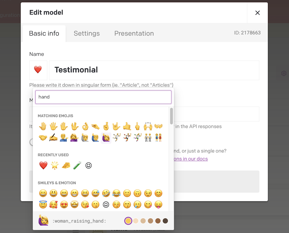
We believe that even small touches can make a big difference. That's why we've introduced the ability to use emojis as icons for your models and blocks. Just use the handy emoji picker when editing a name, and watch as your schema transforms into a colorful, easy-to-navigate landscape.

Adding an emoji lets you visually distinguish different elements at a glance. For instance, you might mark your marketing-related models with a 📣, or use a 📕 for educational content. It's a small detail that can make identifying your content types more enjoyable.
Let's keep the conversation going
As excited as we are about these updates, we know the journey doesn't stop here. We want to hear from you - how these changes fit into your work, what you love, and what you'd tweak. Your input is the wind in our sails, guiding us toward an even better DatoCMS.
So give these new features a whirl, pop over to our Community, and let's chat. Whether you have a suggestion, a question, or a bit of praise, we're all ears!
