Responsive widths
A simple plugin that allows saving large, medium, and small widths, for use with column blocks

This is a Community Plugin! Learn how create your own plugin, or copy and
remix existing ones in our documentation
Responsive widths
A simple plugin that saves an object structured like:
{large: "", medium: "", small: ""}
Where each key represents a screen size, and the screen size metric is stored as a string, assumed to be a percentage.
This plugin is ideal for a grid column block, rendered within a modular content field of a grid block.
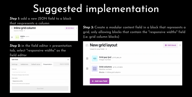
Suggested implementation:
- Add a new JSON field to a block that respresents a column
- in the field editor > presentation tab, select "responsive widths" as the field editor
- Create a modular content field in a block that represents a grid, only allowing blocks that contain the "responsive widths" field (i.e. grid column blocks)
You can check out the youtube video tutorial on the suggested implementation here: <https://youtu.be/OgZE1A8W0hA>